Data visualization techniques are graphical representations of information and data. Data visualization tools provide an accessible way to see and understand trends, outliers, and patterns in your data using visual elements such as charts, graphs, and maps. This blog on data visualization techniques will help you understand the detailed techniques and benefits.
Data Visualization
Data visualization provides a quick and productive way to use visual information to communicate your message comprehensively. It is used in almost every industry to increase sales for existing customers and to target new markets and demographics for potential customers.
Uses of data visualization
- Its main use is in the preprocessing part of data mining processes.
- It is an effective way of analyzing data that gives good results.
- Acts as a sector mixer as part of the data reduction process.
- Aids the data cleaning process by identifying incorrect or missing values.
Simply put, data visualization is a universal and effective way to clearly show what raw information means through visuals. There are a variety of techniques that can be used to visualize data, which we will discuss in this blog.
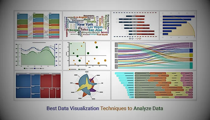
Top 10 data visualization techniques to use in 2024
You don’t need to be a data scientist or other data analytics expert to be adept at presenting data in a practical way. Once you have completed your data analysis, choose the appropriate visualization type based on the data you are working with and the type of story you want to tell.
Charts
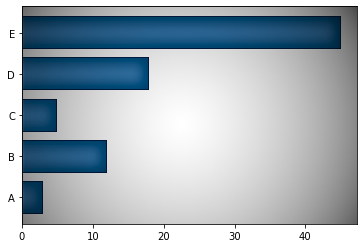
This is the best type of visualization for comparing multiple categories over time. Horizontal bars indicate category growth over time. The longer the bar, the higher the price. This is very easy. For even more detailed information, you can group data from different subcategories at once. Just use different color schemes to differentiate them.
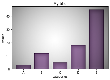
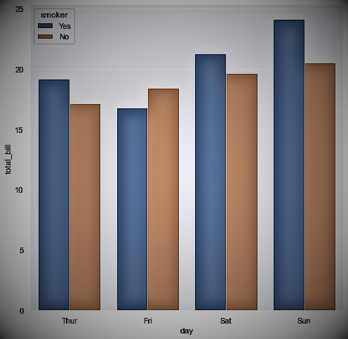
Bar charts rank data according to values in several categories. It consists of rectangles whose length is proportional to the value of each category. Bar graphs are popular because they are easy to read. Businesses commonly use bar charts to make comparisons, such as comparing the market share of different brands or the revenues of different regions. There are many types of bar charts, each suitable for different purposes.
There are several types of bar graphs, each suitable for a different purpose, such as column plots, horizontal bar plots, and clustered bar plots.
Histograms
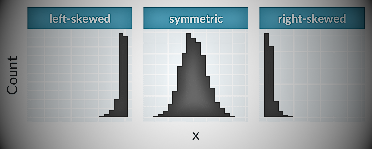
Histogram is one of the most common visualizations for analyzing the distribution of data. Shows the distribution of numerical variables as bars.
To create a histogram, first divide your numerical data into categories, or bins and calculate the frequency of each category. The horizontal axis shows the range, and the vertical axis shows the frequency or percentage of occurrence of the range.
Histogram represents the frequency of numerical data as a rectangle. The vertical axis shows the frequency of the variable. The horizontal axis displays the values of variables such as day and month.
Histograms quickly show how skewed the distribution of a variable is, or where it is extreme. Below is an example from our Data Demystification series on data visualization that captures the distribution.
Box plots/Whisker plot
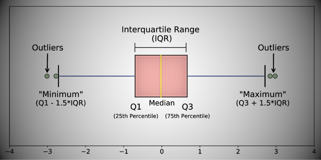
Boxplots are ideal for exploratory data analysis because they can summarize data measured on an interval scale. A boxplot shows the distribution of data points, their variability, and the central value.
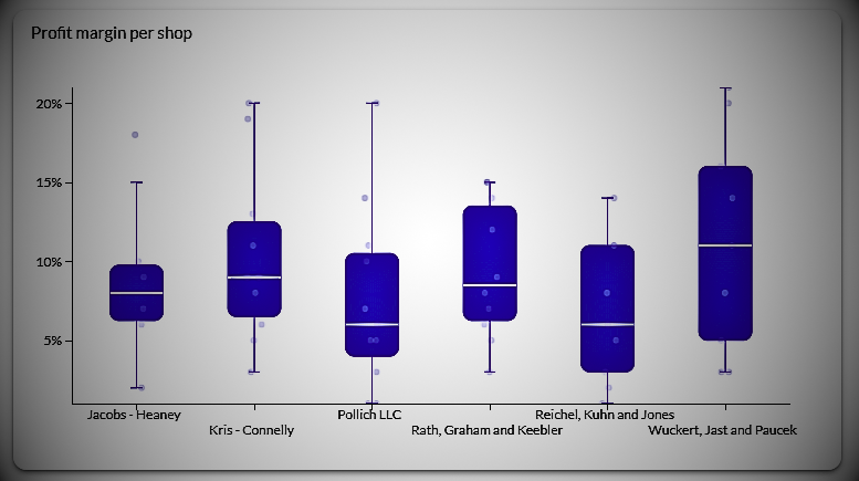
Boxplots allow you to see both the spread and outliers, and this type of visualization doesn’t take up much space on the average dashboard.
Boxplots provide an intuitive and robust way to find the following elements:
- Median. Intermediate values of the dataset. 50% of the data is less than the median and 50% of the data is greater than the median.
- Top quartile. 75th percentile of the dataset. 75% of the data is below the top quartile and 25% of the data is above the top quartile.
- Lower quartile. 25th percentile of the dataset. 25% of the data is below the lower quartile and 75% of the data is above the lower quartile.
- Interquartile range. top quartile minus bottom quartile
- Above the adjacent value. Colloquially, it means “maximum value.” This represents the top quartile plus 1.5 times the interquartile range.
- Low value of neighbor. Colloquially, it means “minimum price.” This represents the lower quartile as 1.5 times less than the interquartile range.
- Outliers. Values greater than “Maximum Value” or less than “Minimum Value”.
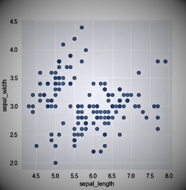
Scatter plots
Scatter plots are used to visualize the relationship between two continuous variables. Each point on the plot represents a data point, and the location of the point on the x- and y-axis represents the values of two variables. Often used in data exploration to understand data and quickly uncover potential correlations,.
The following example again uses the Iris dataset to plot sepal width versus sepal length.
Bubble plot
It shows colorfully how many values are in each category. The higher the value, the larger the bubbles will be in the visualization. You can see an overview of the top categories at a glance.
You can adjust the size and number of bubble charts to show the exact type of data you need and add layers of interactivity.
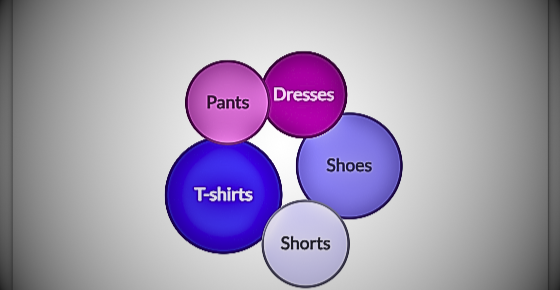
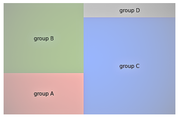
Treemaps
Treemaps are great for showing part-to-whole relationships in your data. Displays hierarchical data as a series of rectangles. Each rectangle is a range within a particular variable, but the area of the rectangle is proportional to the size of that range. Compared to similar visualizations such as pie charts, tree maps are considered more intuitive and better.
Heat maps
A heatmap is a common and beautiful matrix plot that can be used to graphically summarize the relationship between two variables. The degree of correlation between two variables is represented by a color code.
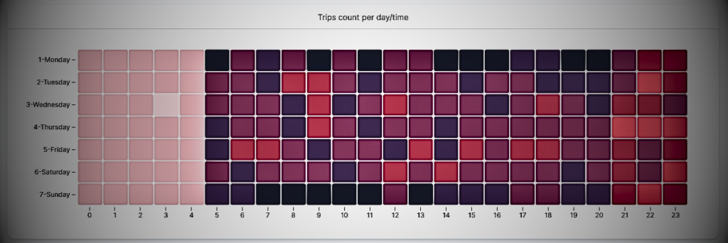
Generally, the darker the color of the heatmap field on the grid, the higher the value. Just by looking at the colors in a heatmap, you can quickly draw conclusions about the underlying data.
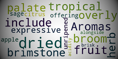
Word clouds
A word cloud, also known as a tag cloud or text cloud, is a visual representation of text data. It is a cloud that contains a list of words, and the larger the word, the more often it is used in the text.
World Cloud is useful in the following scenarios:
- Quickly identify the most important topics and subjects in large amounts of text.
- Understand the overall feeling and tone of the text.
- Examine patterns and trends in data containing textual information.
- Communicate important ideas and concepts in an engaging way.
Maps
A significant portion of the data generated daily is spatial in nature. Spatial data (also known as geospatial data or geographic information) is data where each record has a specific location associated with it.
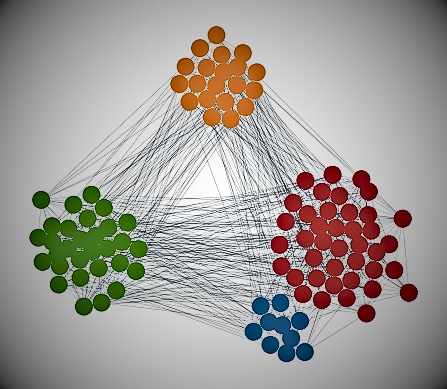
Network diagram
Most of the data is stored in tables. However, these are not the only formats available. So-called graphs are suitable for analyzing data organized within networks, from online social networks like Facebook and Twitter to transportation networks like subways. Network analysis is a subdomain of data science that uses graphs to study networks.
A network graph has two main components: nodes and edges (also known as relationships). This is an example of a simple network graph.
follow me : Twitter, Facebook, LinkedIn, Instagram